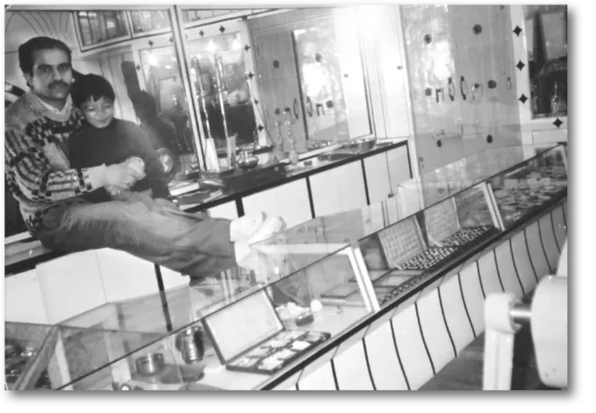
The story of Verma Sons Jewellers’ brand identity is a testament to tradition embracing transformation. The original red logo, with its bold color and classic typography, signified passion, heritage, and the unwavering spirit with which Verma Sons Jewellers served its patrons for decades. Its red hue radiated confidence, energy, and the festive vibrance of jewellery — a symbol of celebration and family legacy.
With Aarushi Verma’s entry, the logo underwent a sophisticated evolution reflecting the brand’s leap into a new era. The typography was modernized, with each letter designed for balance and clarity, a nod to both precision in craftsmanship & new-age sensibilities. The newly introduced symbol — an abstract ‘V’ accented with elegant horn-like curves — captures the essence of jewellery itself: artistry, status, and timeless beauty. The form echoes regal motifs found in traditional ornaments, suggesting crowns, diadems, and the delicate arches seen in intricate jewellery making. Its upward sweep hints at both heritage roots and aspirations for future growth.